The site was organized around the institution. I restructured it around how students look for advising.
Academic advising at Missouri S&T was organized around the institution’s internal structure (colleges, not departments) in a way that made sense to administrators and nowhere else. Students looking for their advisor ended up in the wrong office because the site couldn’t tell them which office was the right one. That wasn’t a content gap; it was a structural problem.
UX Designer, Missouri S&T.
I led the redesign and built it myself in Terminalfour, Missouri S&T’s CMS. As one of three designers at the university, I ran discovery, navigated faculty stakeholders, and shipped the site. The project ran during finals week, so I made the deliberate choice not to pull students into sessions when they needed to focus. I worked from competitive analysis and proxy signals instead, and named that tradeoff honestly.
The structural decision, and what it fixed.
The whole project came down to one question: organize by college, or by department? Prior conversations with faculty and staff, and the existing wrong-office problem, pointed to a consistent pattern: students were more likely to search by department than to know which college it belonged to. Department-first navigation meant more pages to build and more faculty coordination, but it was the structure most likely to match how students actually looked for their advisor.
Midway through, I hit a stakeholder wall: faculty weren’t sharing department details proactively. I stopped asking and instead gave them a mockup to react to and correct. That shift unblocked the project. The site is live at advising.mst.edu. Students find their advisor by looking up their department, not by guessing which of three colleges their program belongs to.
Go deeper
I was redesigning a site for students without being able to talk to students. Here’s how I made decisions anyway.
The project ran during finals week. We made the deliberate choice not to pull students into research sessions while they needed to focus. By the time the semester ended, the window had closed. I was designing a site for students without being able to talk to students.
What I had instead: competitive analysis across peer institutions, prior conversations with faculty and staff, direct observation of the current site’s structure and where it broke down, and one consistent signal from everywhere I looked: students were landing in the wrong places.
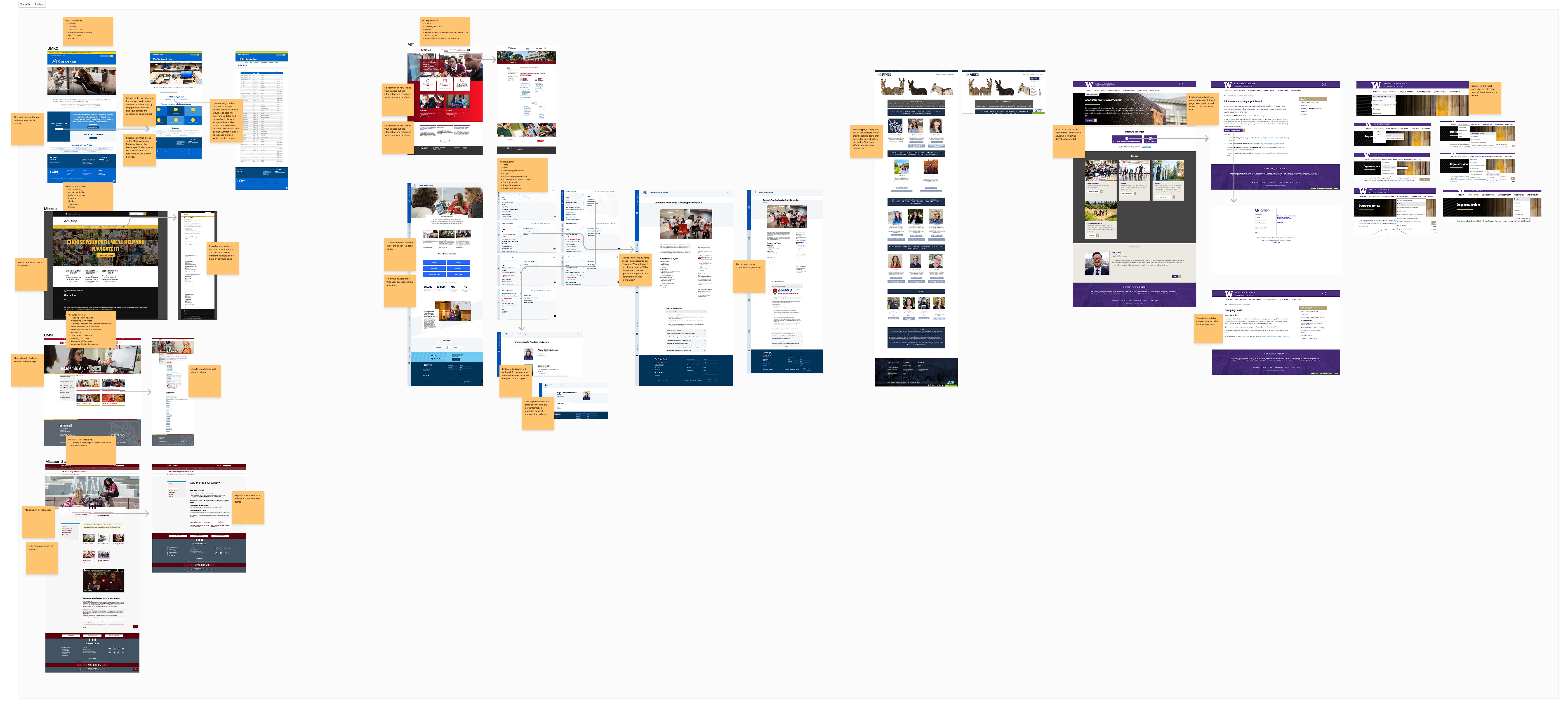
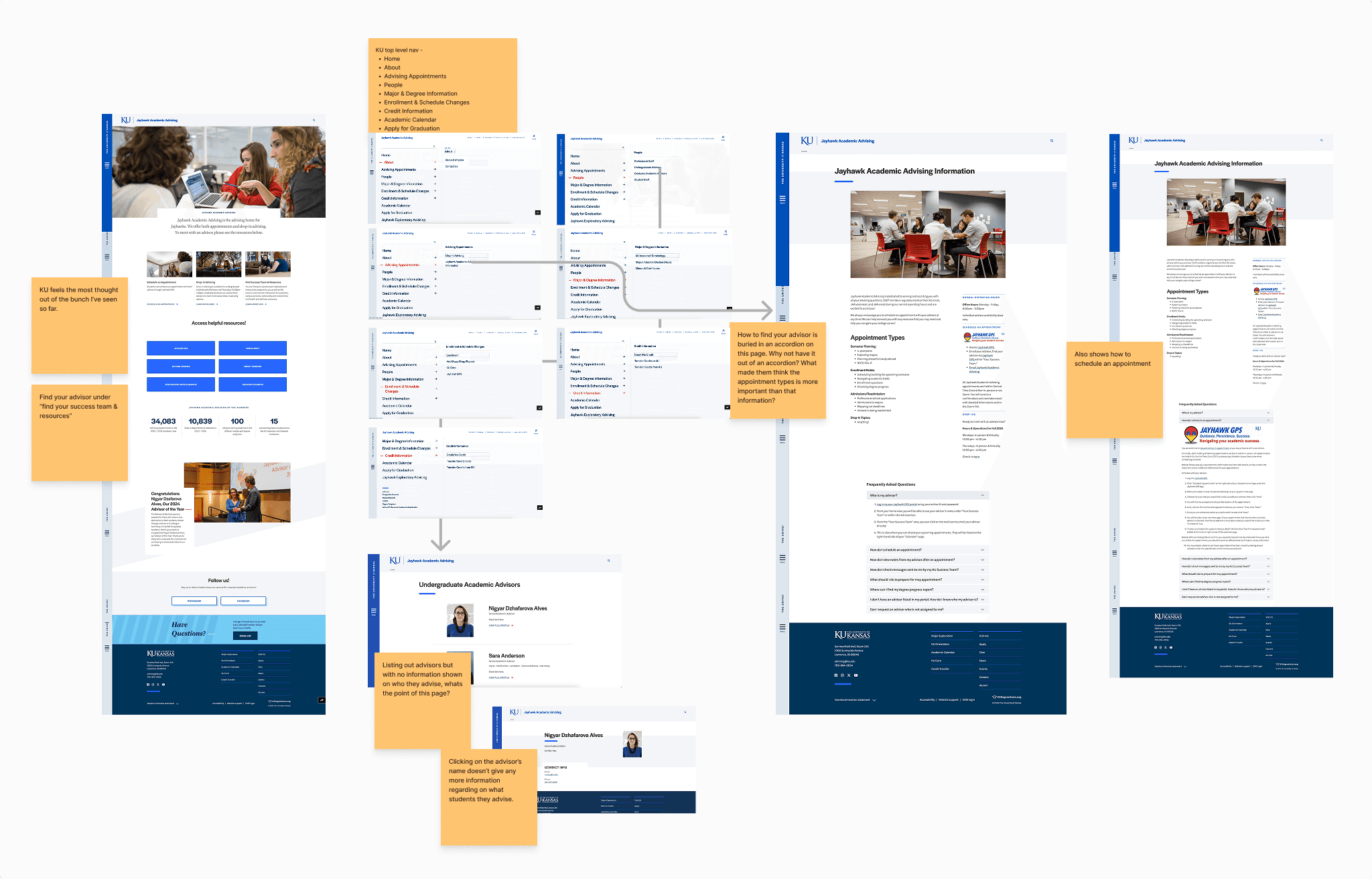
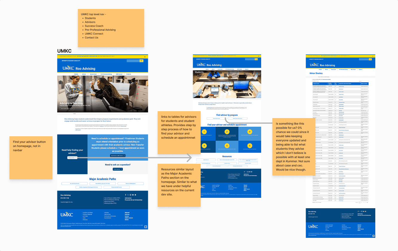
The competitive analysis did real work. I benchmarked UMKC, UMSL, and Mizzou. What the strongest sites had in common was that they organized information around what students were trying to do, not around how the university was structured. UMKC segmented by role (students, advisors, success coaches) and let users self-identify up front. UMSL published extensive resources including advisor outcomes and process maps. Most importantly, several universities organized advising by program or department rather than by college, which supported the structural hypothesis I was already forming from the wrong-office data.
None of that is a substitute for direct user research. I named the constraint honestly in the case study rather than obscuring it, and formal usability testing is planned for the next iteration. But it was enough to make confident structural decisions, and the structural decisions were the whole project.
Waiting for proactive input from faculty wasn’t working. I changed the loop.
After early mockups and the competitive analysis, the project stalled. I didn’t have enough department-level detail to build pages that would actually serve each program’s students. Many faculty members were cautious about the new site; they had legitimate concerns about accuracy, about what would be published, about who would maintain it. Those concerns made them careful about sharing information. Understandable, but it left real gaps.
The direct route wasn’t working. Emails asking for information, follow-ups, waiting. Some departments responded. Others, silence.
The pivot was straightforward: instead of asking faculty to produce information proactively, I built a preliminary structure from what I had and sent it to them with a different question. Not “tell me what your advising process looks like.” But: “I’ve written down what I think your advising process looks like. Is any of this wrong?”
That shift works because reacting to something concrete is easier than generating information from scratch. It also gave faculty something to evaluate: they could see the tone, the presentation, what it would look like for students before committing to contributing to it. The transparency reduced the concern about what the site might become. Most corrections came back within a week. The project unblocked.
Give people something to react to, not a blank page to fill. The question changed from “what do you know?” to “what have I gotten wrong?”
The whole project came down to one question: by college, or by department?
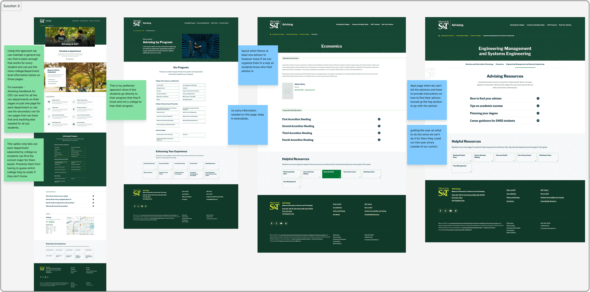
Three options for organizing the site: by college, by college with department links, or by department directly. Step back from the implementation details and those aren’t really three options; they’re a spectrum between institution-first and student-first.
The working hypothesis was that students don’t think of themselves as belonging to a college. They think of themselves as Computer Science students, or Civil Engineering students. Missouri S&T has three colleges (Arts, Sciences, and Business; Engineering; Mines and Metallurgy). Prior conversations with faculty and staff, and the pattern of wrong-office visits, pointed to students frequently not knowing which college their department belonged to. I couldn’t verify this directly with students before launch, but it was the most consistent signal available.
The wrong-office visits were the clearest evidence. Students arrived at a college-level advising office when they needed a department-level one. The existing site served the institution’s organizational logic, and the cost of that was paid entirely by students.
Department-first meant more pages to build, more faculty coordination per page, a bigger maintenance surface. All real tradeoffs. But the student who arrives at the site and finds their department immediately is a student who doesn’t call the wrong office, doesn’t walk across campus to the wrong building, doesn’t lose forty minutes getting redirected. That’s the tradeoff worth making. Whether the structure works in practice is exactly what the planned usability testing will measure.
Building it yourself changes your relationship to your own decisions.
I designed the experience and built it in Terminalfour, Missouri S&T’s CMS. That changes the relationship you have with your own design decisions in a way that’s hard to replicate through handoffs.
When you’re passing specs to a developer, there’s an abstraction layer between what you intended and what shipped. That layer absorbs ambiguity in both directions: the developer fills in gaps with their judgment, and you may not find out until you’re reviewing the build. When you’re implementing it yourself, that gap is yours, and you find it immediately.
Constraints I discovered during implementation fed back into the design in real time. Some layouts that worked visually required rethinking when I understood how Terminalfour’s templating actually behaved. Some flexibility I’d designed in wasn’t feasible in the CMS’s model. On a project with a tight timeline and a three-person design team, that feedback loop was a significant advantage.
Being one person doing both jobs isn’t always right; it can collapse the space between design and implementation too early, before the design has been properly stress-tested. On this project, with a CMS I knew and constraints I needed to understand first-hand anyway, it was the right call.
Live and in use.
The site is live at advising.mst.edu. The structural decision held: department-first navigation, consolidated into a single experience, with enough clarity that students can find their advisor without knowing which college their department belongs to. Formal usability testing is planned for a future iteration to measure where it can keep getting better.
I believe the structure is right. I haven’t proven it yet, and I know the difference.
The biggest open question is whether department-first navigation actually solves the problem it was designed to solve. The evidence pointed that way. A usability test would confirm it.
What I’d want to measure: can a student who doesn’t know which college their department belongs to navigate directly to their advisor’s page? That’s the specific claim the design makes. The competitive analysis and faculty feedback gave me confidence it’s true. A usability test would prove it.
The edge case I’d pay particular attention to: double majors, students mid-change-of-major, and programs that span colleges. The current structure is optimized for the clean case: one student, one department, one advisor. Academic realities are messier. I want to know how the site handles someone whose situation doesn’t fit neatly into a single department page.
Formal usability research is planned for the next iteration. That’s where this work gets validated or revised.
The system was the obstacle.
Students were expected to manage complex academic requirements across disconnected tools, with little guidance, leading to confusion around responsibilities, next steps, and ownership.
The core failure wasn’t usability. It was a lack of clarity and continuity across the system.
What broke down, specifically
Students struggled to find advising info. Content was scattered across multiple sites and systems. The previous advising.mst.edu only served a select group of students, but didn’t make that clear, so students often visited the wrong offices for their needs.
Information wasn’t organized in a way students understood. Content was structured around internal organization (colleges) rather than the way students actually think about themselves (their department or program).
This led to confusion and inefficiency. Students spent extra time searching, wandering, and ending up in the wrong places before finding what they needed.
Lead UX Designer · also built the site.
Leadership and ownership
I led product design from discovery through implementation. As one of three designers at the university, I was responsible for ensuring the solution was clearly defined, executed, and delivered. I built the site myself in Terminalfour, the university CMS.
Cross-functional collaboration
I worked closely with faculty, department staff, and advisors to understand the advising process and align on a solution that balanced student needs with institutional requirements.
A research constraint, named honestly
We couldn’t conduct direct research with students; the project ran during finals week, and we deliberately chose not to involve students in the lead-up so they could focus. By the time the semester ended, the window had closed. Future iterations will involve student feedback.
From “improve advising usability” to help students take the right action at the right time.
Improving advising wasn’t about adding more content. It required restructuring the experience to:
- Centralize critical actions and information.
- Guide students through key journeys: planning, registration, graduation.
- Make responsibilities and deadlines explicit.
Help students take the right action at the right time without needing external support.
Streamlined methods, meaningful signal.
Given the tight project timeline, I prioritized efficient, insight-driven methods instead of full-scale user testing.
Competitive analysis
I benchmarked against similar university advising sites to identify effective patterns and gaps.
- Similarities: Most sites covered the essentials: advisor contact and appointments, degree planning, and academic support resources.
- Differences: UMKC segmented navigation by user role (students, advisors, success coaches). UMSL included extensive resources like advisor outcomes and myConnect info. Mizzou focused more on grades and transcripts.
When information stops flowing, change the loop.
After early mockups and a competitive analysis, progress stalled. I didn’t have enough department-level detail to ensure the experience would meet each program’s needs. Many faculty members were hesitant to share details and concerned about the new site (understandable, but it left gaps).
Pivoting the approach
I consulted the VC of Student Success to surface essential advising info that applied to all students. Then I switched to a mockup-first feedback loop: I built a preliminary structure and shared it with faculty, asking them to correct inaccuracies rather than relying on proactive information gathering. That shift unblocked the project while keeping the design student-centered.
Preparing for buy-in
I prepared a slide deck outlining the proposed site structure and user experience to support alignment across departments. Although it wasn’t ultimately needed, it was ready for presentation to stakeholders if required.
Three options, one student-centered choice.
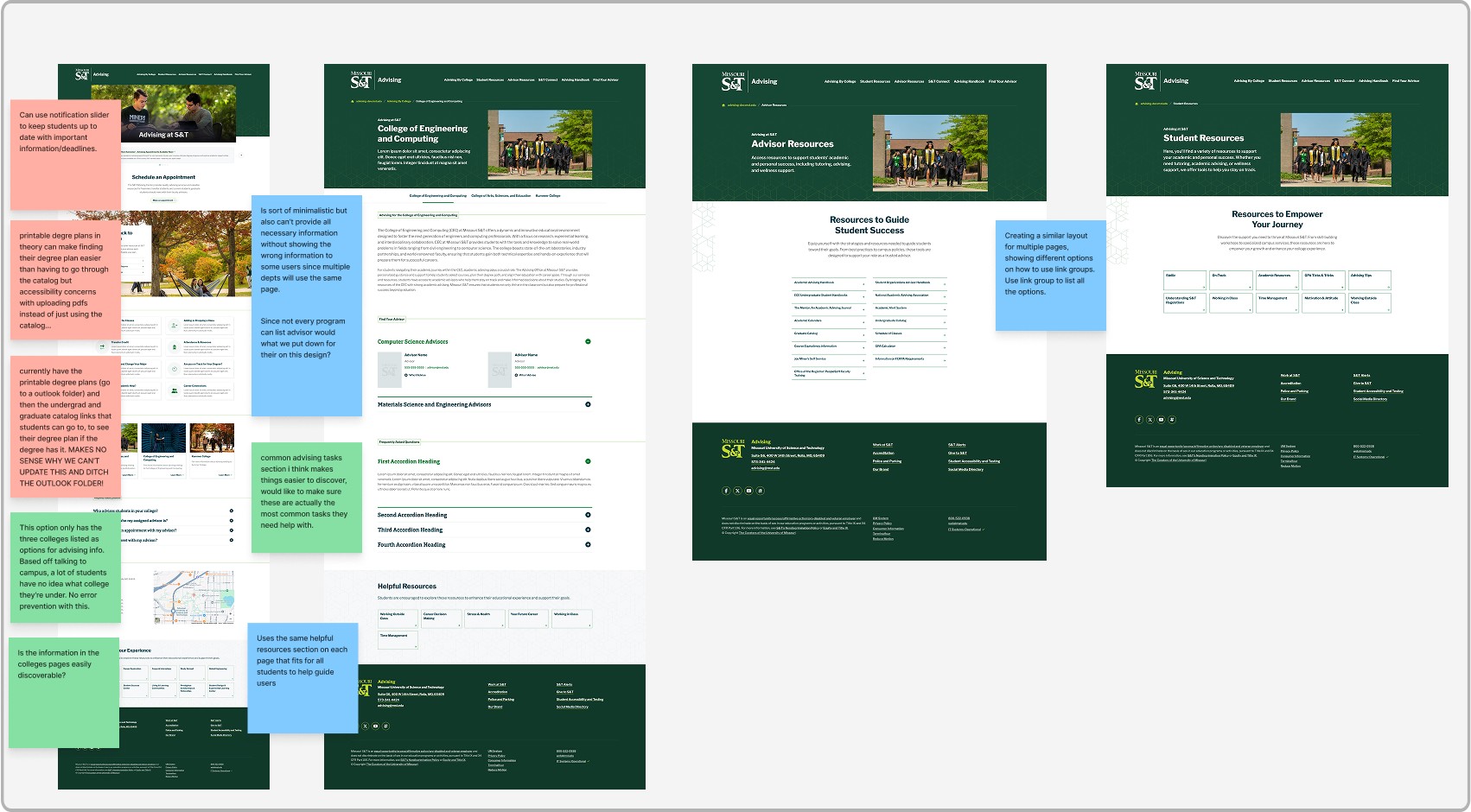
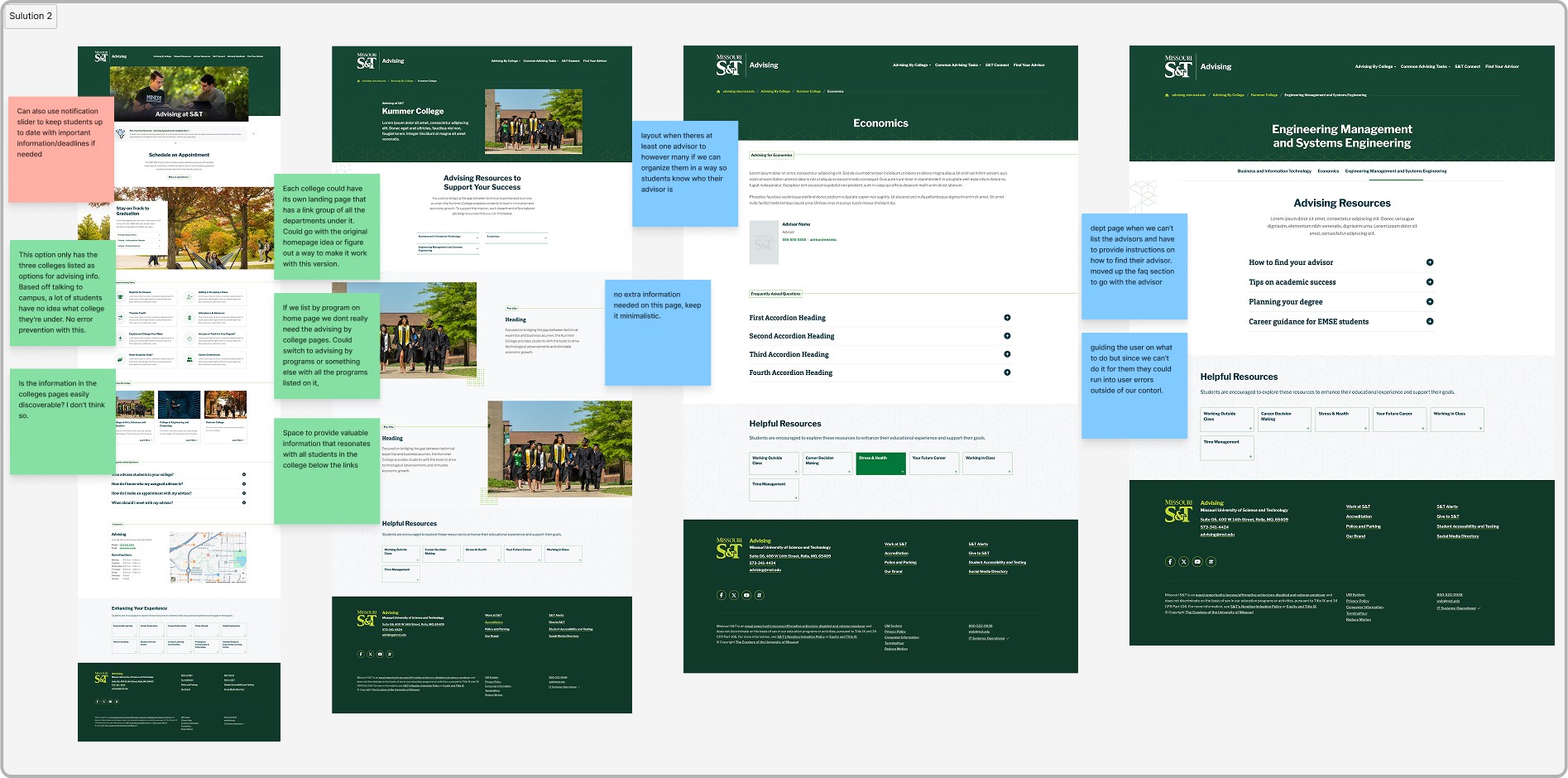
- By College, a broad overview of each of the three colleges.
- By College with Department Links, college-level info linking out to each department’s page.
- By Department, every department listed directly, no need for students to know which college they belong to.
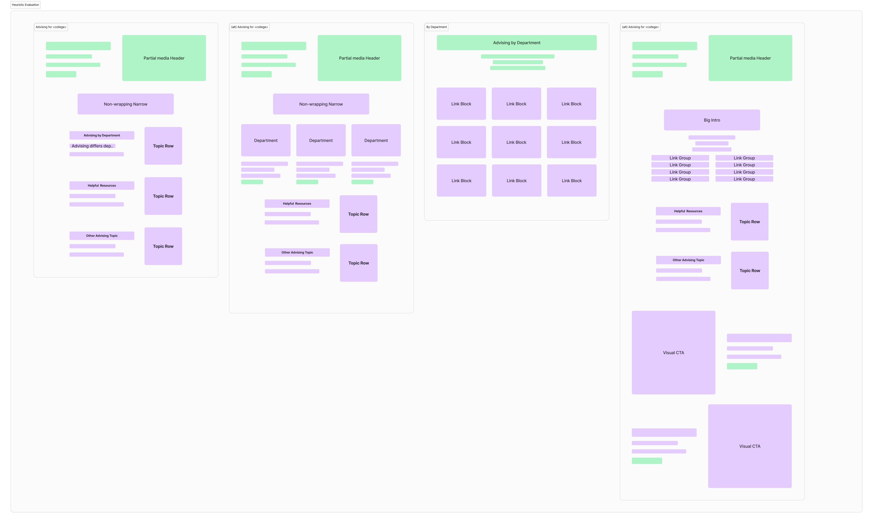
Heuristic evaluation
I evaluated each of the three proposed structures against usability best practices for higher education web design, assessing clarity, navigation, and alignment with how students actually look for advising information.
Choosing the best student experience
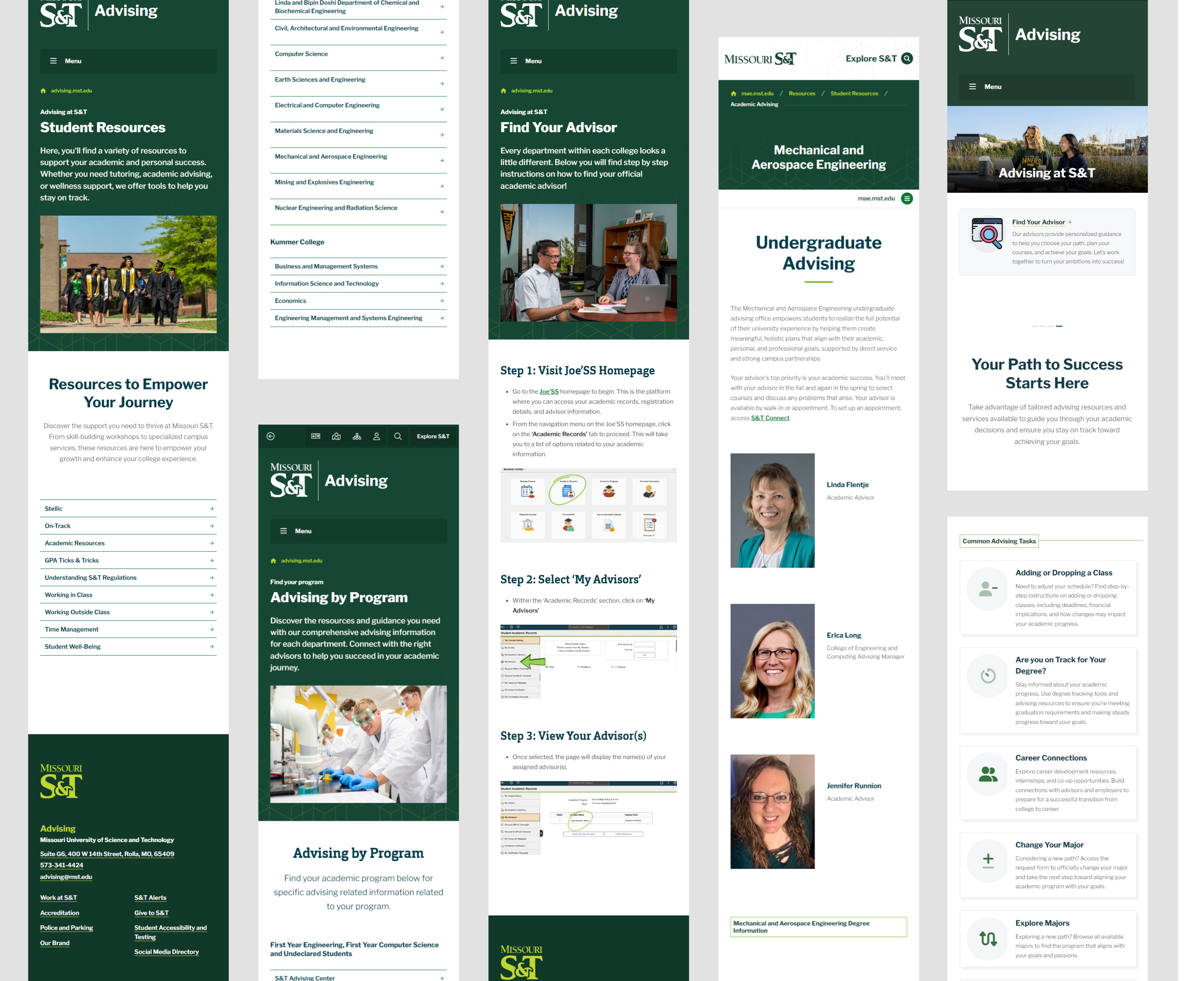
We organized the site by department. From prior conversations with students, faculty, and staff, we knew many students aren’t aware which college their department belongs to. Department-first navigation eliminated that friction and minimized clicks.
Each department got a dedicated advising page hosted on its own site, linked from the central advising hub. Pages included advisor contact info, advising processes, and forms / important links. Centralized organization with departmental autonomy: a consistent shell, flexible content underneath.
Two structural moves did most of the work.
Step back from the details, and the whole redesign came down to two decisions that everything else served:
1 � Consolidate advising into one experience
One destination instead of scattered systems, so students never had to figure out which office or site owned their answer.
2 � Organize around students, not the org chart
A department-first structure with a consistent shell and flexible content underneath, so every program felt familiar while still fitting its own needs.
Live and in use.
The site is live at advising.mst.edu. Formal research and usability testing are planned for a future iteration to measure how students are navigating the experience and where it can keep getting better.
What changed, in one sentence.
The biggest shift was moving from a system-centered structure to a student-centered journey.
Instead of expecting students to figure out the system, the experience now guides them through it.
If I continued this work
- Personalization based on student progress.
- Predictive guidance for upcoming requirements.
- Better support for edge cases and non-traditional paths.