We stopped eSIM from losing people. Adoption jumped 75%.
T-Mobile’s eSIM activation was quietly broken. The flow stopped explaining itself at exactly the point users needed the most clarity: technical jargon with no context, fragmented steps owned by different teams, no sense of where they were or how far they had to go. We were losing users at exactly the wrong moment — some committed to activating, others still checking if their device was compatible.
UX Designer, T-Mobile via WongDoody.
I split the surface with a senior designer across BYOD, MyTMO, and the new-purchase journey. The problem wasn’t missing features; it was missing clarity at specific moments of hesitation.
Where we put the work.
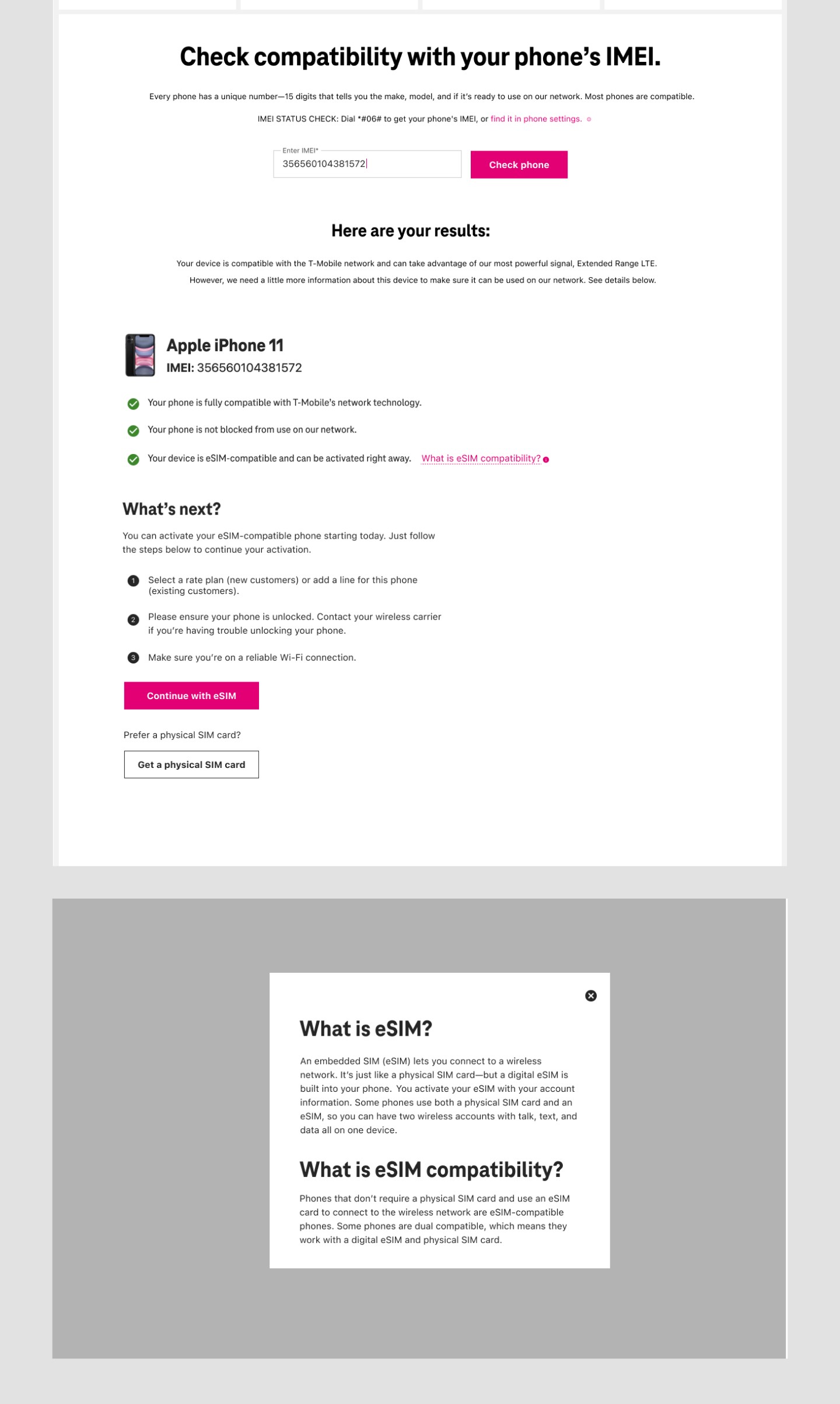
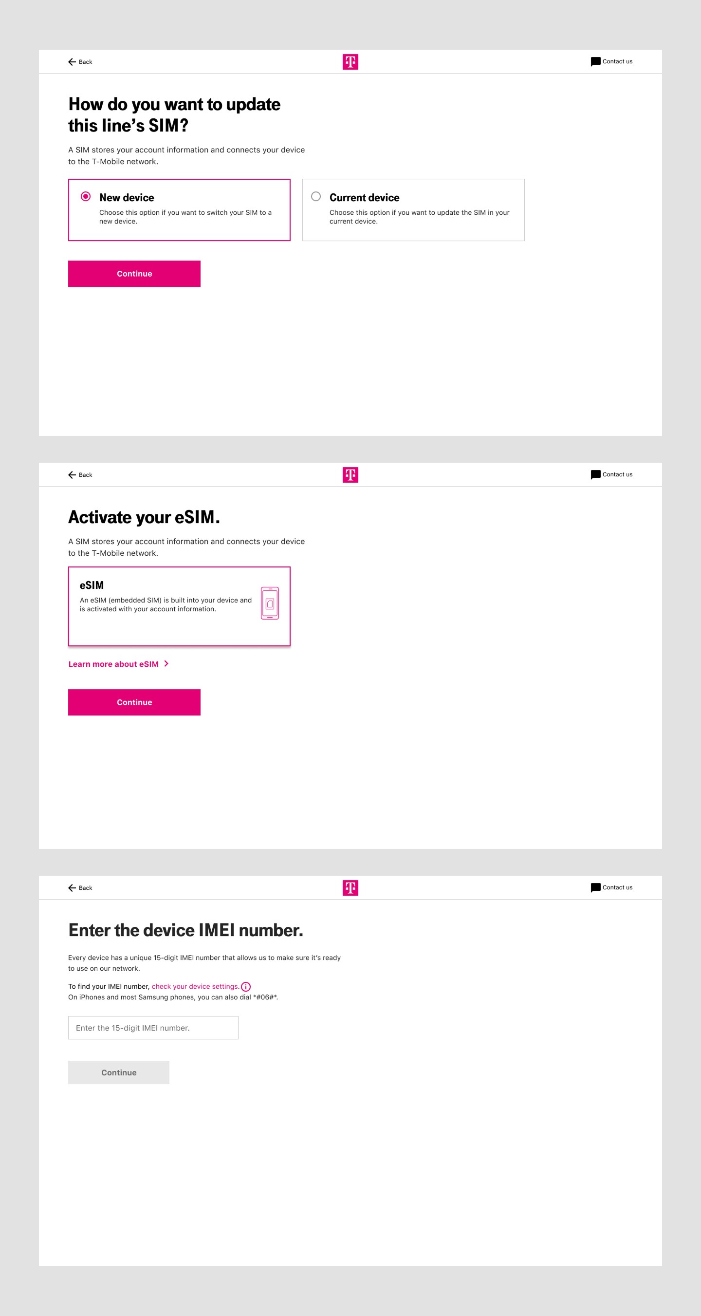
We clarified the IMEI step: plain language, instructions for where to find your IMEI, and a button hierarchy that didn’t accidentally send users out of the flow. We put guidance directly where users needed it, in context, rather than routing them to separate help pages. And we kept the physical SIM path clearly available for users who weren’t eSIM-ready, rather than burying it behind eSIM promotion.
Results.

Go deeper
Most people who reach the BYOD page are serious. Some are just running a compatibility check. Either way, every breakdown I found was friction at exactly the wrong moment.
Most users hitting this page weren’t browsing. They were trying to switch to T-Mobile, activate a new line, or swap a SIM they’d already bought. A smaller group were just running the IMEI checker as a compatibility tool before committing. In both cases, the activation flow was the only thing standing between them and what they came to do.
So when I read through the friction points, I read them against that lens. The IMEI checker living below step two in the page structure but belonging to step one in the actual process: that’s not a layout quirk. That’s confusion at the moment of commitment. Multiple competing CTAs, no progress indicators, a plan selector that appeared twice, a confirmation pill so small users couldn’t tell a line had been added to their cart. All of it landing on someone who was already in.
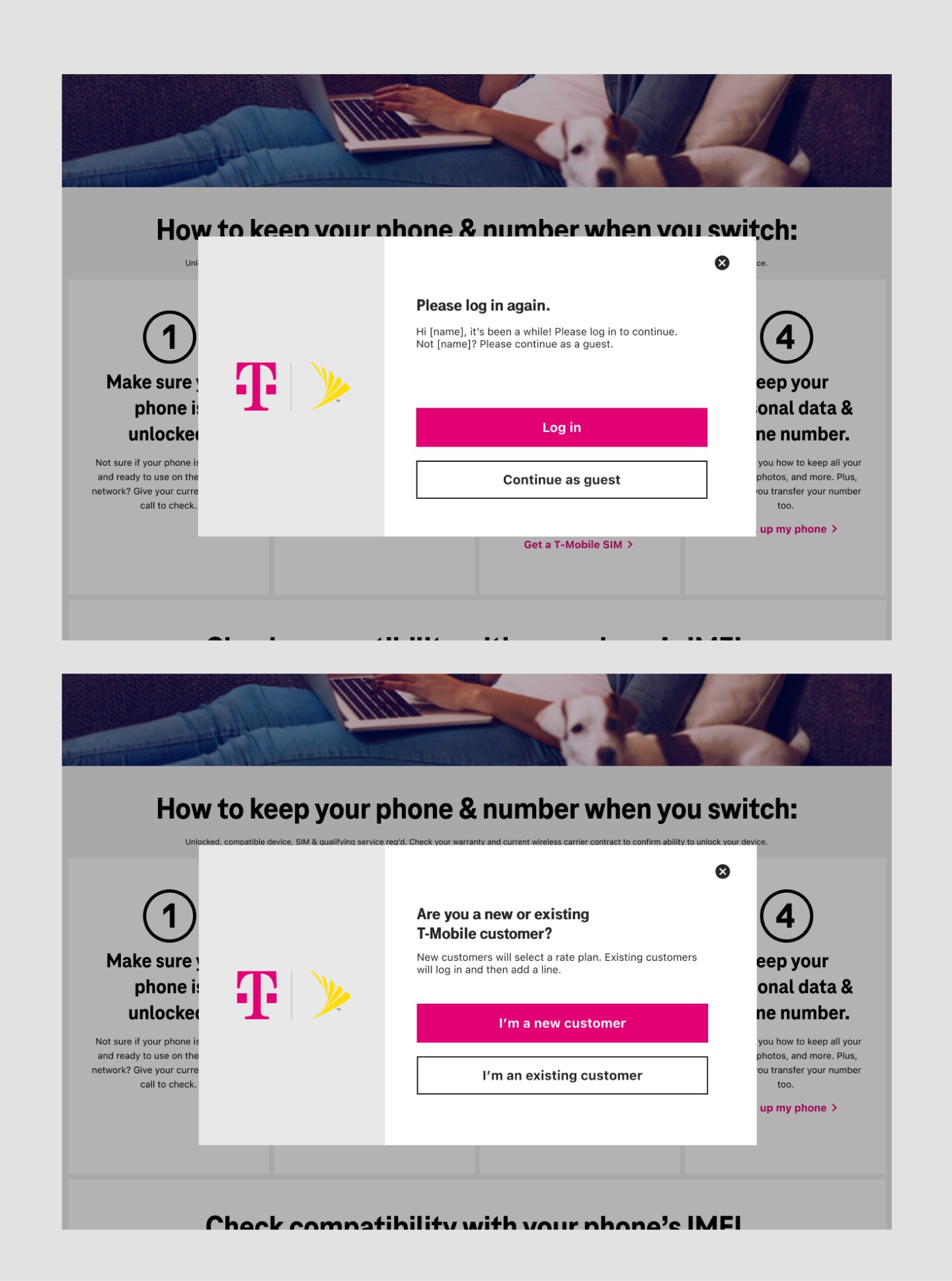
I benchmarked competitors. Mint Mobile showed users which step they were on, with the option to enter an IMEI or select a device by brand and model. AT&T branched the flow early, asking users upfront if they were new or existing. Most carriers that made the technical steps explicit outperformed those that buried them. The problem was legible before I finished the audit.
“Improve the eSIM experience” pointed everywhere at once. I needed a tighter question to design from.
The brief was to improve eSIM adoption. That’s a metric, not a design direction. It could mean marketing, pricing, carrier partnerships, feature changes, almost anything. I needed to find the smallest, most specific thing that would move it.
The audit kept surfacing one pattern: users weren’t confused about eSIM in general. They were confused at specific moments: IMEI entry, device verification, wherever the flow expected them to know something it hadn’t told them. The drop-off wasn’t random. It was predictable. That gave me the tighter question: where, exactly, does the user stop feeling confident? Design for those moments.
The problem wasn’t that users needed more help. It was that they needed help at the exact moment they were already lost.
That reframe sounds small. It wasn’t. It meant we weren’t building more explanation; we were replacing explanation with clarity at the point of need. Inline instead of external. Contextual instead of comprehensive. That distinction shaped every decision that followed.
The ideal solution was a single linear flow. What we had was pages owned by different teams and a backend we couldn’t touch.
The IMEI step was the clearest win, and fully within our control. The input was the actual problem, not the concept, just the implementation. We rewrote the labels in plain language, explained where to find an IMEI right next to the field, and rebalanced the button hierarchy so the accidental-exit button didn’t look like the continue button. That single change addressed the largest individual drop-off point.
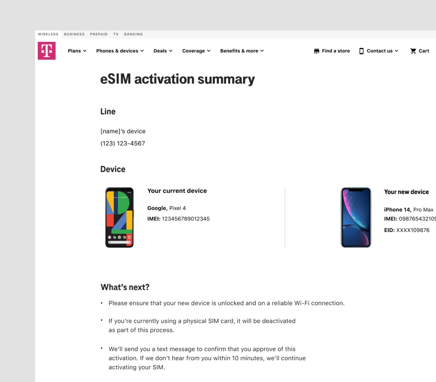
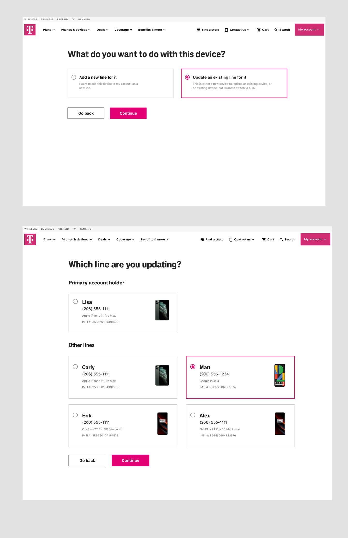
For the multi-page fragmentation, we couldn’t merge pages owned by different teams. SEO requirements locked certain page structures. So we simulated continuity: inline guidance and modals at each step gave users what they needed without requiring other teams to restructure their surfaces. It wasn’t the clean solution. It was the one we could ship, and it worked well enough to move the numbers significantly.
One tension worth naming: the business wanted to push eSIM over physical SIM. But for users who weren’t eSIM-ready (wrong device, wrong plan), forcing the choice creates its own drop-off. We gave eSIM visual prominence without burying the physical SIM option. Keeping the honest path available wasn’t generosity; it was just better conversion logic.
We thought we knew where the friction was. Users showed us where it actually lived.
Fifteen participants, unmoderated, thinking aloud through a click-through prototype. Ages 18 to 65, a mix of genders, all on post-paid plans. The actual demographic of a BYOD customer, not a convenience sample.
Most of what we expected to see, we saw. The moments we’d identified as friction were friction. But copy has a way of hiding problems that wireframes don’t surface. Multiple participants hesitated on the same lines, not because the flow broke, but because a word was wrong, or a sentence ended on a question instead of an instruction. We went back and rewrote those specific moments. Not the design, just the words, and specifically the words at the moments people stopped.
The real surprise was eSIM/physical SIM parity. We’d given eSIM a strong visual lead as the business wanted. Participants who weren’t eSIM-ready felt like physical SIM was hidden. One person asked, out loud, if they could “still do the regular way.” That one question was enough to adjust the hierarchy, not enough to undo the business goal, but enough to keep the honest exit available without making it feel like a buried alternative.
At the iPhone 14 launch.
The reframe did more work than any individual design decision.
Reducing uncertainty is a fundamentally different brief than adding features or improving usability. It points at specific moments, not general quality.
The most transferable thing from this project is that framing. Almost every flow that loses people does so at predictable hesitation points. The question is always the same: where does the user stop trusting the system? Find those moments first. Everything else follows from there.
The follow-on concept, a stepper-based device-tailored linear flow, was the version without the constraints. My contract ended before it shipped. If it had, it would have been the same reframe executed with fewer compromises.
Four numbers, all moving the same direction.
What it meant for the business: lower dependency on retail and phone support, faster adoption of a lower-cost digital product, and stronger first-time success that compounds into retention.
Users dropped off the moment the flow stopped explaining itself.
Users attempting to activate eSIM struggled with unclear system feedback, fragmented steps, and missing guidance at the exact moments they needed it. The result was a flow with three compounding failure modes:
- High abandonment during IMEI entry and device verification.
- Increased reliance on customer support and retail assistance.
- Lost conversions for a high-value digital product.
Three patterns kept showing up
Critical confusion around eSIM. 4 out of 5 customers didn’t know what an eSIM was, and many weren’t sure how to confirm their device supported it, so they hesitated, second-guessed, or made errors that broke the flow.
Multi-step friction. The journey spanned multiple pages owned by different teams, with inconsistent feedback. Cognitive load piled up; uncertainty did the rest.
No contextual guidance. Terms like IMEI and EID were never explained in plain language. Users were left to translate jargon at the worst possible moment.
UX Designer, splitting the surface with a senior designer.
I worked as a UX Designer embedded at T-Mobile from WongDoody, splitting design responsibilities with a senior designer across the eSIM onboarding experience.
Cross-functional partners
A copywriter on every screen of microcopy. UX researchers on what to test, and how. A product owner pushing for clarity on scope. The work shipped because the loop between those four roles was tight.
What I owned
User flows, interaction design, and content structure across BYOD, MyTMO, and the new-purchase journey, each with different ownership boundaries and different constraints.
Where the existing flow lost people.
One signal shaped how I read everything else: most people who reach the BYOD page were serious, either switching to T-Mobile as a new customer or swapping a SIM as an existing one. A smaller group were using the IMEI checker as a compatibility tool before committing. Either way, every breakdown below was friction in front of someone at a decision point.
With a tight timeline, I leaned on existing research and a close audit rather than net-new studies, journey-mapping each flow and benchmarking competitors to pin down exactly where users slipped.
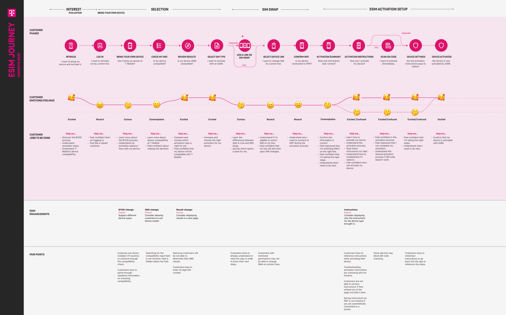
Journey-mapping the current BYOD flow (prospects)
- Too much on the BYOD page, with no clear sense of where to go or what to click.
- “Check compatibility” sat under step two, but the IMEI checker lived further down the page, out of order with the steps.
- No sense of progress: nothing told users which step they were on or how many were left.
- Too many CTAs competing for the same attention.
- Users had to select their plan twice.
And the Add-A-Line flow (existing customers)
- It never showed the new total monthly bill, only the added cost of the line and phone.
- It didn’t let users change their plan.
- It surfaced the deal the business wanted to promote even when the user wasn’t eligible for it.
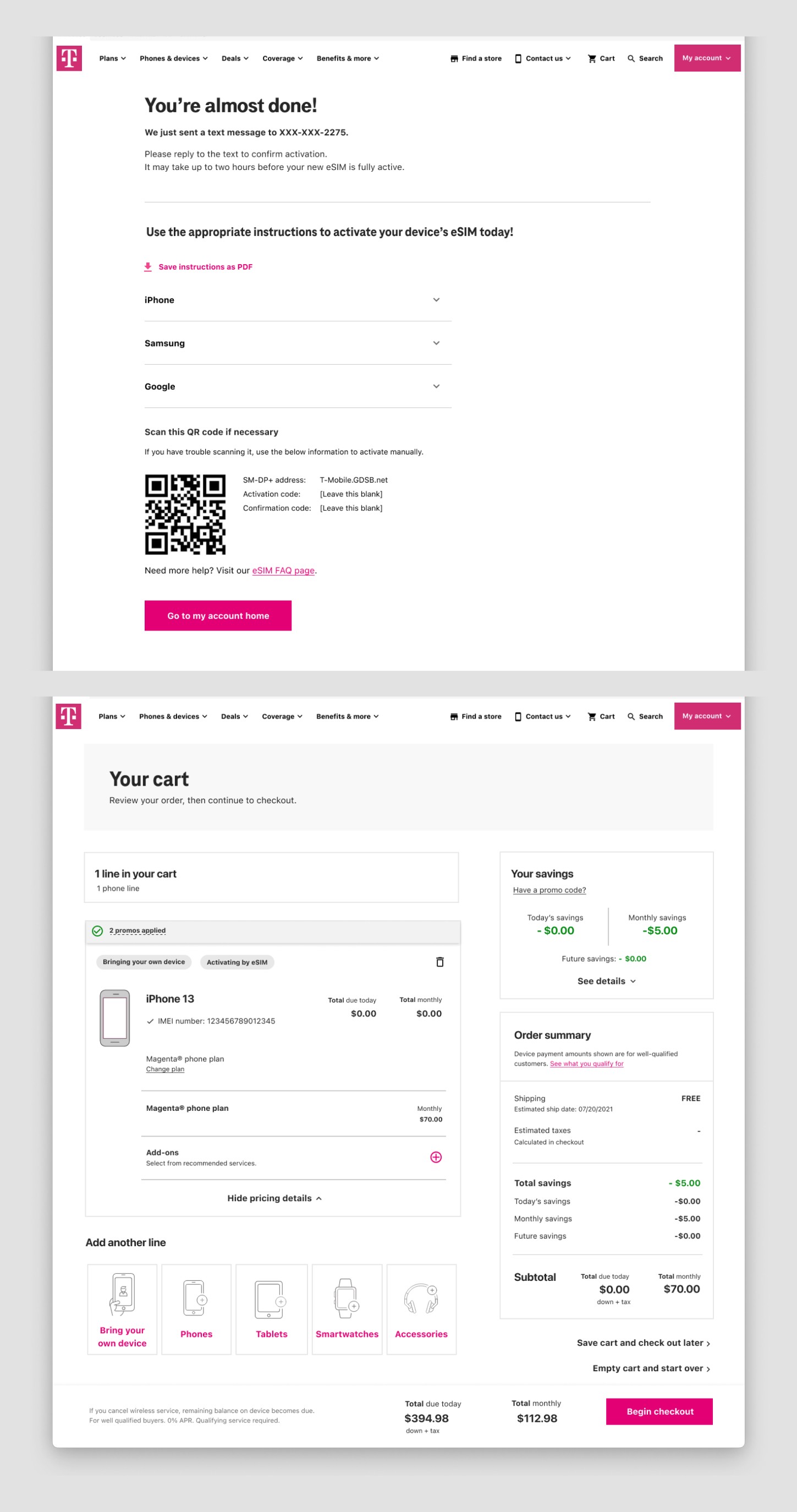
- The confirmation pill on the cart page was nearly hidden, so users couldn’t tell a line had been added.
What benchmarking competitors told us
- Only AT&T and T-Mobile explained what an eSIM actually is.
- Mint and Cricket put the IMEI checker right on the BYOD page, and Mint showed users which step they were on, with the option to enter an IMEI or pick by brand and model.
- AT&T had visitors declare up front whether they were new or an existing customer adding a line, branching the flow early.
- Google Fi, like T-Mobile, went deep on device compatibility, while most carriers kept the prospect flow to very few steps.
Different surfaces, one root cause: the flow made users do the system’s work. That pointed straight at the reframe.
From “improve the eSIM experience” to reduce uncertainty at the moments users hesitate.
Improving adoption was never about adding more screens or more instruction. The job was to remove the moments where users stopped feeling confident.
- Reduce friction at the documented drop-off points.
- Translate technical concepts into plain language, in context.
- Give clear, immediate feedback during every critical interaction.
The problem wasn’t that users needed more help. It was that they needed help at the exact moment they were already lost.
Four moves that turned hesitation into completion.
1 � Simplifying the IMEI step
The IMEI input was the largest single drop-off. We rewrote technical terms in plain language, explained where to find an IMEI right next to the field, and rebalanced the button hierarchy so users wouldn’t click out of the flow by accident.
2 � Embedding education in the flow
Instead of separate help pages, guidance lived where the question was asked, inline tips and modals at the exact decision point. Users no longer had to leave the flow to understand it.
3 � Streamlining multi-page flows
The original journey crossed pages owned by different teams. We minimized unnecessary steps, clarified the next action on every page, and added visual cues to keep momentum forward even where team ownership prevented full consolidation.
4 � Designing within constraints
Backend limits and SEO requirements were real. We used inline guidance and modals to simulate a more linear, step-by-step experience without forcing changes to other teams’ pages.
Validated with users, then tightened.
We ran a remote, unmoderated usability study: 15 primary account holders on post-paid plans, a mix of ages (18 to 65) and genders, working through a click-through desktop prototype while thinking aloud, with a follow-up survey.
What testing changed
Tighter copy. We rewrote the specific moments where participants hesitated or misread what a step was asking of them.
Equal footing for eSIM and physical SIM. The business wanted to push eSIM, but physical SIM was still a valid path for many customers. We gave the two options equal visual weight so eSIM led without burying the alternative, keeping the choice honest for anyone who wasn’t eSIM-ready.
A reworked instructions page. New copy and formatting so activation guidance was scannable at the moment users actually needed it.
What I’d carry forward.
The most impactful shift was focusing on reducing uncertainty rather than adding more instruction.
If I continued the work
- Personalization based on device compatibility and user context.
- More proactive guidance during edge cases and failure states.
- Further simplification as backend constraints evolve.
A follow-on refresh moved toward a stepper-based, device-tailored linear flow. My contract ended around the time it was put on hold, details remain under NDA.