The brief said UI refresh. The problem was identity.
T-Mobile was migrating from phone-number-based identity to T-Mobile IDs, but the F&BV Digital Profile still ran on the old system. I joined what was scoped as a UI refresh, read through what it actually required, and told stakeholders the project was misscoped before opening Figma. The frozen backend forced the core design question: how do you make an experience feel native to a new identity model when every database call still uses the old one?
UX Designer, T-Mobile via WongDoody.
I secured the scope correction with stakeholders in one conversation before any design started, then redesigned the identity model with engineering as my closest partner. We figured out together what was buildable, and those constraints directly shaped every design decision.
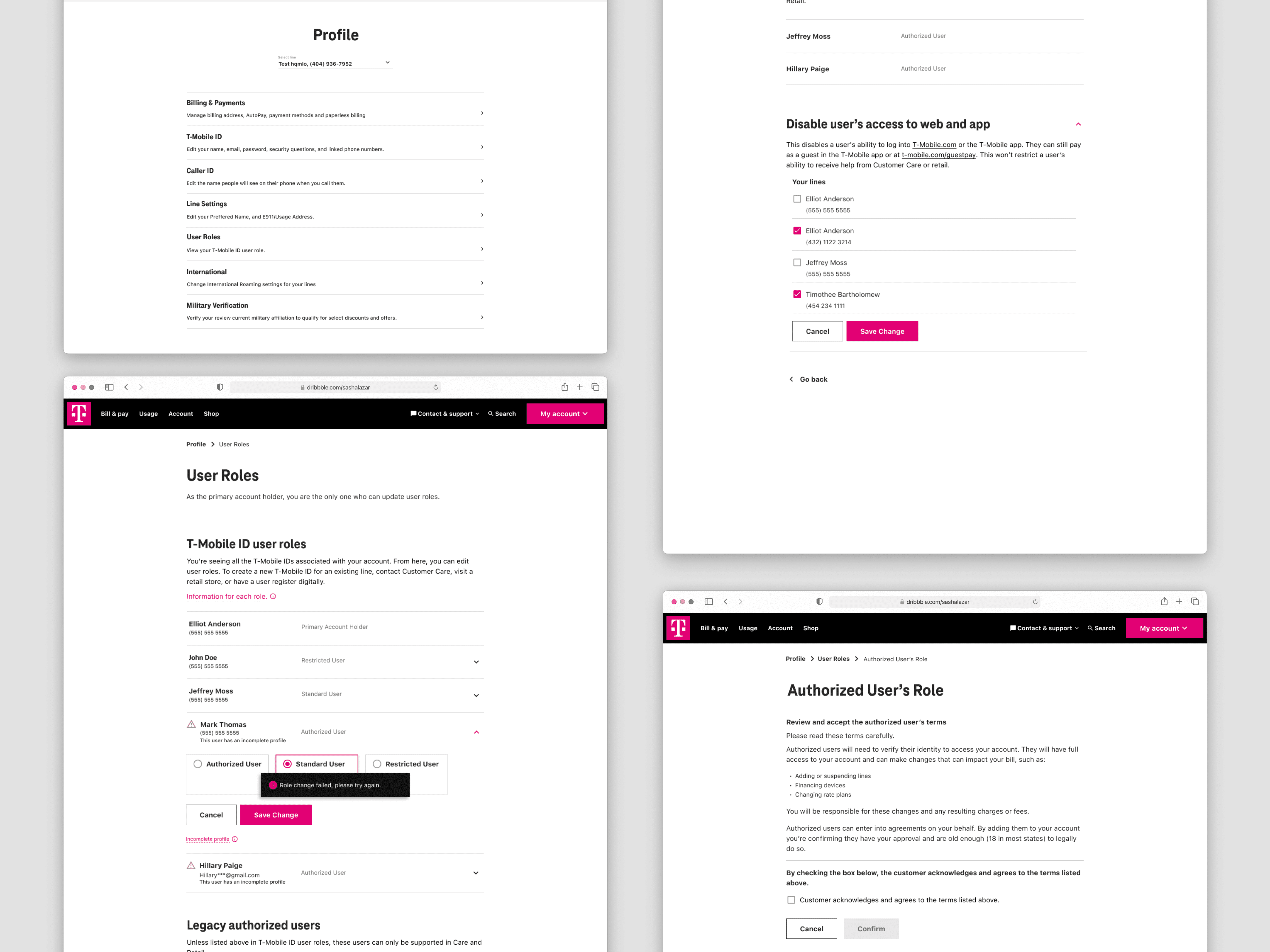
The sharpest problem, and what it unlocked.
One person with three lines could hold a different role on each. The experience needed to show a single coherent role at the T-Mobile ID level, with no backend change. I resolved it by surfacing the highest role held across any attached line: honest to how permissions actually work, invisible to users who didn’t need to see it, and shippable inside the frozen infrastructure.
The redesign established T-Mobile’s new consumer identity model and became the foundation other T-Mobile initiatives were waiting on.
Go deeper
The most consequential design work happened before I opened Figma.
The project came to me because another designer was overloaded. The brief said UI refresh. I read through what the refresh actually required and called stakeholders.
What the refresh required was changing how roles displayed, which meant designing for four distinct user experiences, which meant touching how permissions were communicated across the account. A UI refresh treats the surface as separable from the system. This wasn’t.
I spent an afternoon building the case: here’s what’s actually being asked for, here’s what a cosmetic refresh gets you, here’s what we need to do instead. The argument wasn’t that I wanted a bigger project. It was that shipping what we were currently scoped for would solve nothing and we’d redo this work in six months.
Stakeholders agreed the same day. More scope, more time, more coordination. All of it came out of one conversation that happened before I’d opened Figma. The cost of scope misalignment compounds fast. Catching it at kickoff is essentially free.
The backend was the brief. Once I accepted that, the constraints stopped being obstacles.
T-Mobile IDs were the future of the company’s identity model. The F&BV Digital Profile was one of the first experiences that needed to live in that future. But the backend (where roles were stored, how they were looked up, how permission changes were processed) ran entirely on MSISDNs. Phone numbers, not IDs. No time, no budget to change it.
So: design an experience that feels native to T-Mobile IDs, that users would encounter as part of a company-wide identity shift, that would function as a model for other surfaces, while every database call underneath it still ran on the old model.
Engineering became my real partner. Not “design, then hand to eng.” Every constraint they named shaped a design decision, and every design decision I brought back surfaced constraints they hadn’t fully articulated yet. The daily standups were the actual work. We were figuring out together what was buildable, not me designing the ideal and negotiating down from it.
The gap between the frozen backend and the experience I was designing was the design problem. Naming it clearly made every subsequent decision easier.
One person, three lines, three different roles. The experience needed to show one thing. So which one?
T-Mobile’s backend assigned roles per phone number, per line on the account. One person could hold three lines, and hold a different role on each: Primary Account Holder on line one, Authorized User on line two, Standard User on line three. The experience needed to show that person a single coherent role at the T-Mobile ID level, with no backend change.
Resolving multiple roles under one T-Mobile ID
The backend stored roles per phone number. One person could have three different roles across three lines. The experience had to present a single coherent role at the T-Mobile ID level, without exposing that complexity to users, and without touching the frozen backend.
What made it worth shipping wasn’t just simplicity; it was accuracy. If you hold a Primary Account Holder role on any line, you have those capabilities. That’s not an approximation; it’s correct. The simplification aligned with reality, which is the only kind worth building.
“Line permissions” tested poorly. Replacing it wasn’t cosmetic work.
Resolving the role model was the structural decision. Making it legible to users was the other half of the same work. Prior research found users disliked the phrase “line permissions.” It felt opaque, like managing technical settings rather than managing people on their account. So I replaced it.
That sentence sounds small. The work wasn’t.
Every label, subheading, confirmation message, error state, and flow transition was running on terminology that described how the system worked, not how users thought about what they were doing. The system managed line-level permissions tied to MSISDNs. Users were deciding who could do what on their account. Those are not the same sentence.
Rewriting the language across the experience wasn’t polish applied at the end. It was the thing that made the T-Mobile ID framing feel real, rather than like a UI painted over the old model. You can change all the visual design you want; if the words still say MSISDN, users feel the backend. Language is the interface. Updating it was load-bearing work.
The work other teams were waiting on.
The redesign of the F&BV Digital Profile established T-Mobile’s new identity model, defining how user roles are managed under T-Mobile IDs across all consumer accounts (not business accounts). Multiple company-wide initiatives had been blocked on this foundation. It didn’t exist before. The project also extended T-Mobile ID adoption into Retail, not just Digital, which had been a separate gap.
Three principles that came out of this project directly.
Scope misalignment compounds fast. Catching it at kickoff is essentially free. Catching it after design is very expensive.
Engineering partnership isn’t a nice-to-have; on constraint-heavy projects, it’s structural. The backend constraint meant I couldn’t know whether a design was feasible without a real conversation. Not a Jira comment, not a spec attachment. Actual daily back-and-forth where their constraints shaped my decisions and my decisions surfaced theirs. The designs we shipped were better than anything I would have produced alone.
Language is infrastructure, not polish. The identity framing only worked because the words changed. On any project where the underlying model is in transition, the language update is load-bearing, not cosmetic. That distinction matters for when it gets prioritized and how much time it gets.
The work other teams were waiting on.
Cross-company unlock. This redesign of the Fraud & Blind Verification (F&BV) Digital Profile established T-Mobile’s new identity model, defining how user roles are managed under T-Mobile IDs across all accounts (excl. Business). Multiple company-wide initiatives were blocked on it, and it extended T-Mobile ID adoption into Retail, not just Digital. That shared foundation didn’t exist before.
Identity built on phone numbers, in a world moving past them.
T-Mobile’s F&BV Digital Profile experience was built around MSISDNs, phone numbers. Every user role, every permission, every touchpoint tied back to a phone number. As T-Mobile pushed toward a unified identity model built on T-Mobile IDs, that experience no longer reflected how the business needed identity to work.
End-to-end ownership, including ownership of figuring out what the project was.
I owned this project end-to-end: identifying the real scope, convincing stakeholders to act on it, defining the experience direction, collaborating with engineering daily, and seeing it through delivery under significant pressure.
This was not a handed-down brief with a clear path. The first and most important design decision was figuring out what the project actually needed to be.
The brief said UI refresh. The work said experience redesign.
When I joined, the project was scoped as a UI refresh. Another designer was slated for it but was swamped, so I stepped in. At kickoff it became clear the requested changes were not cosmetic; they touched how roles displayed, how permissions worked, and how the experience would behave for four distinct user types.
I brought it to stakeholders directly. I walked them through what the requested changes would break if treated as surface-level, and what we would need to do differently to actually solve the problem. The conversation shifted the project from a quick visual pass to a full experience redesign.
Shipping a refreshed UI on a broken foundation would have been faster and would have solved nothing.
That was not a small ask: more time, more scope, more coordination. Stakeholders agreed because the case was clear. Getting that alignment early was what made everything else possible.
Research from prior projects, used efficiently.
The timeline didn’t support new research. I grounded the work in existing studies from related areas of the account experience: surveys, unmoderated usability tests, tree sorting, card sorting.
The patterns were consistent: users had difficulty finding role settings, the existing language around permissions was confusing and disliked, and role changes took too long when users needed to make them. That gave me a foundation to design from without a research timeline that didn’t exist.
The backend was the design problem.
The real obstacle was technical. T-Mobile was shifting its identity model from MSISDNs to T-Mobile IDs, but the backend behind this experience couldn’t be migrated to match; no time or budget to change it. Roles and permissions would keep running on phone numbers underneath, exactly as before. My job was to make the experience feel fully T-Mobile ID-driven to users, even though nothing beneath the surface had actually changed.
That made engineering my closest partner. I worked with the dev team and its manager daily, in meetings and over Slack, not handing over specs and waiting for feedback, but in genuine back-and-forth where technical constraints directly shaped design decisions, and design decisions surfaced constraints engineering hadn’t fully articulated yet.
Every hard call on this project traced back to that gap between the frozen backend and the experience we wanted. The sharpest one is broken down in the key decisions below.
One identity model. Four very different experiences.
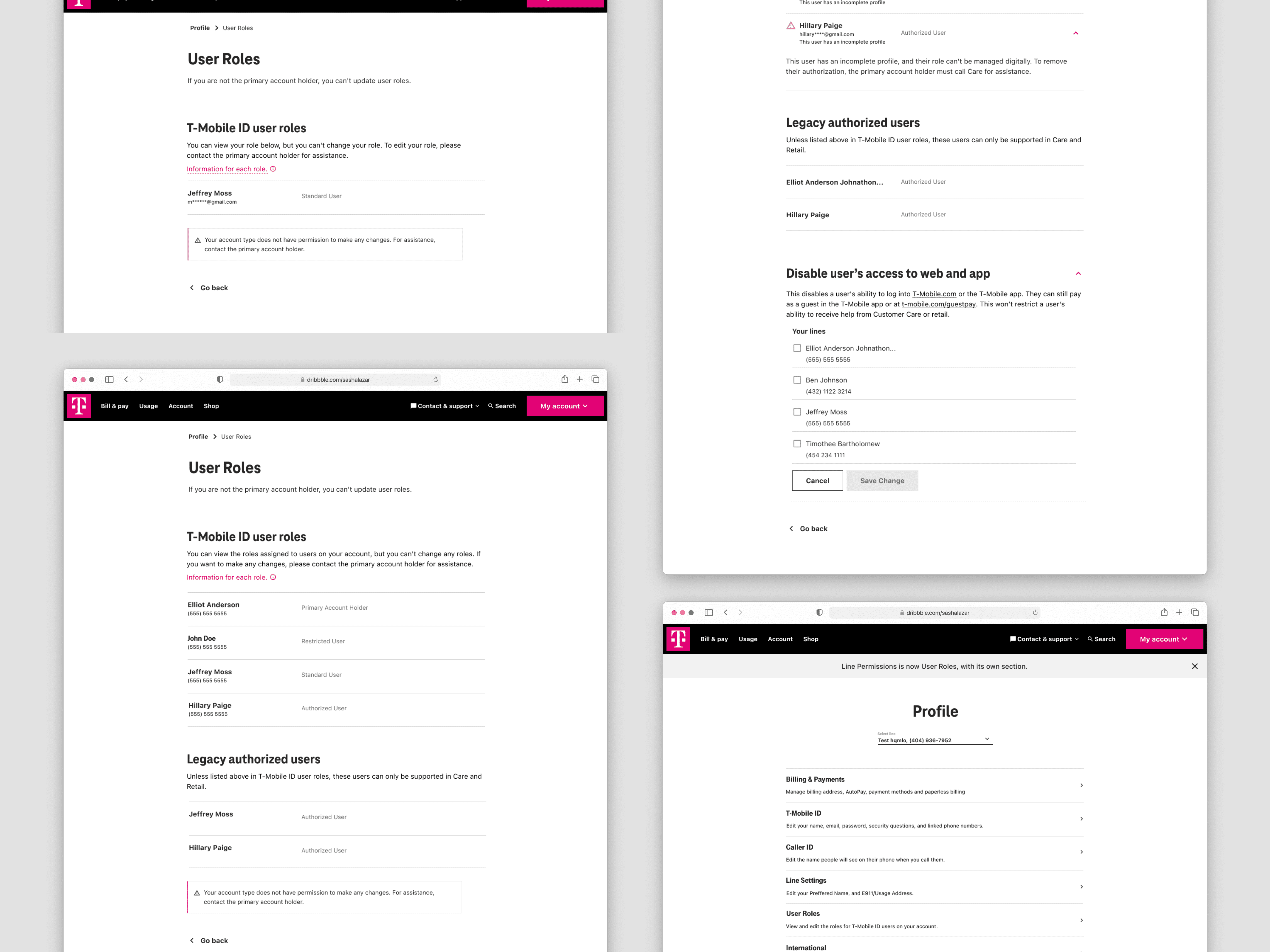
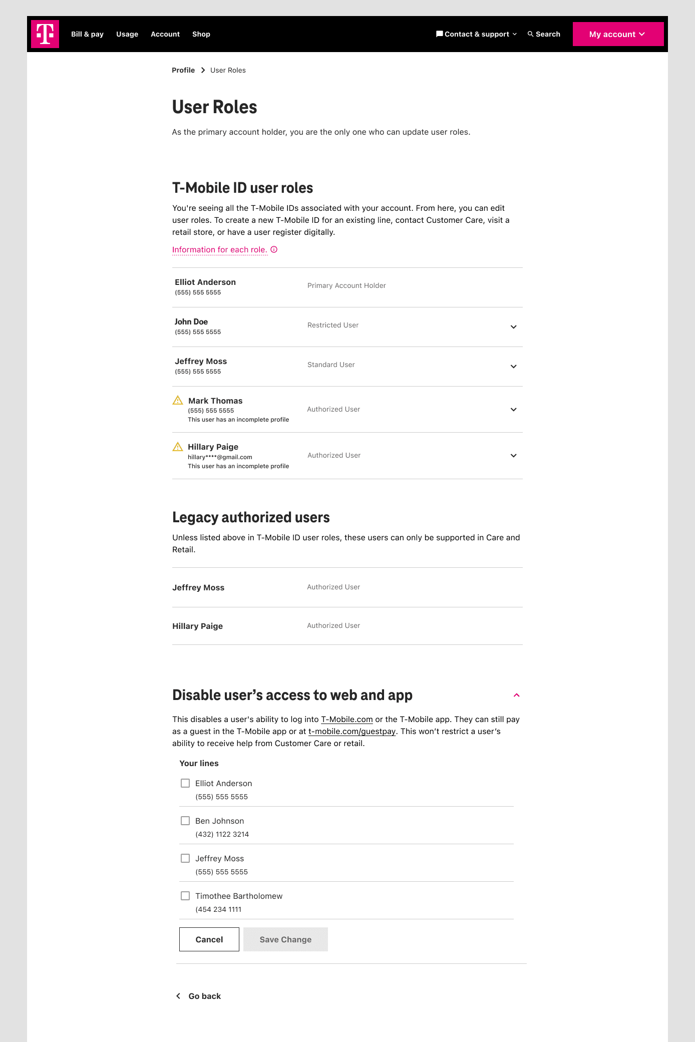
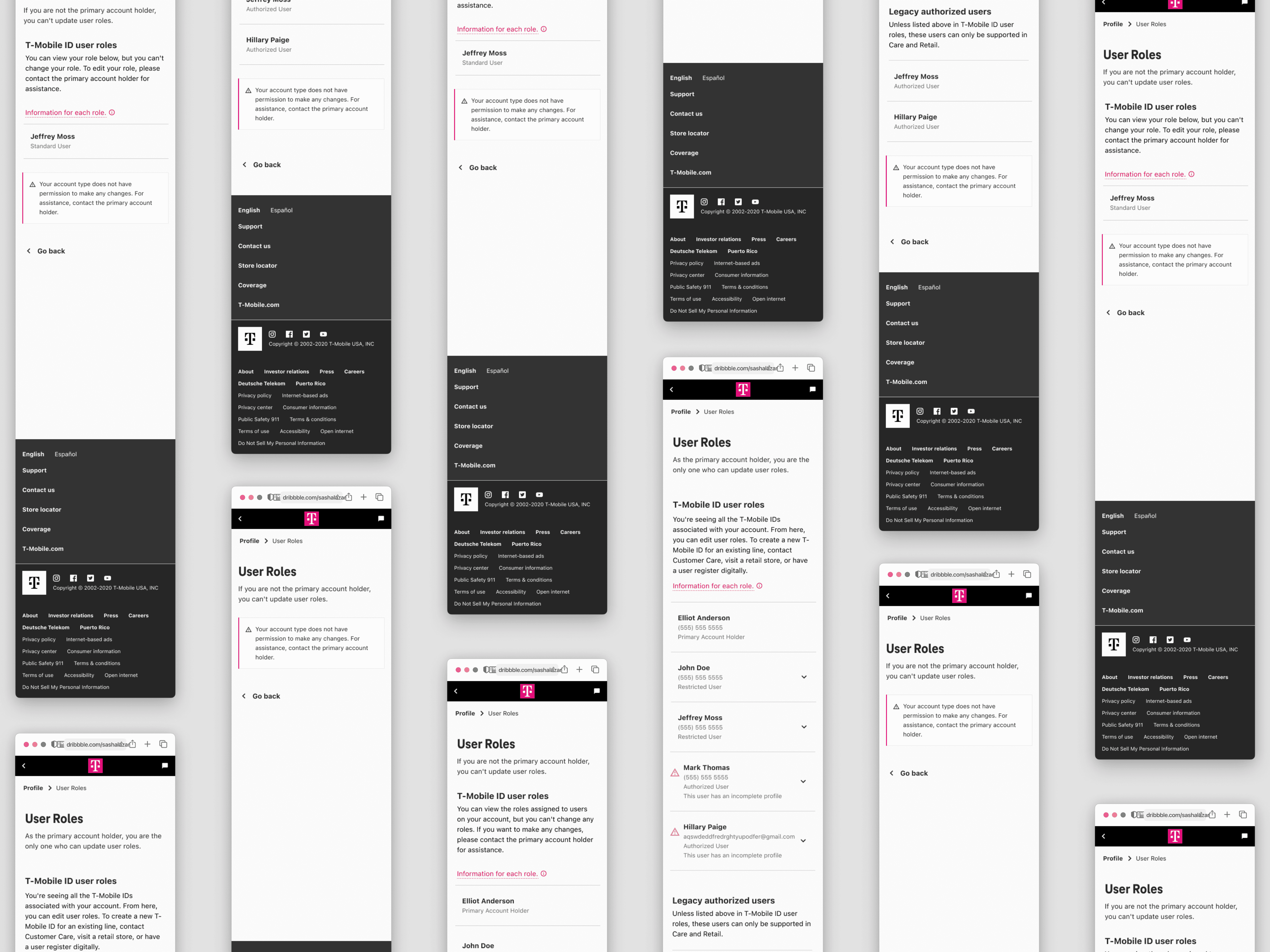
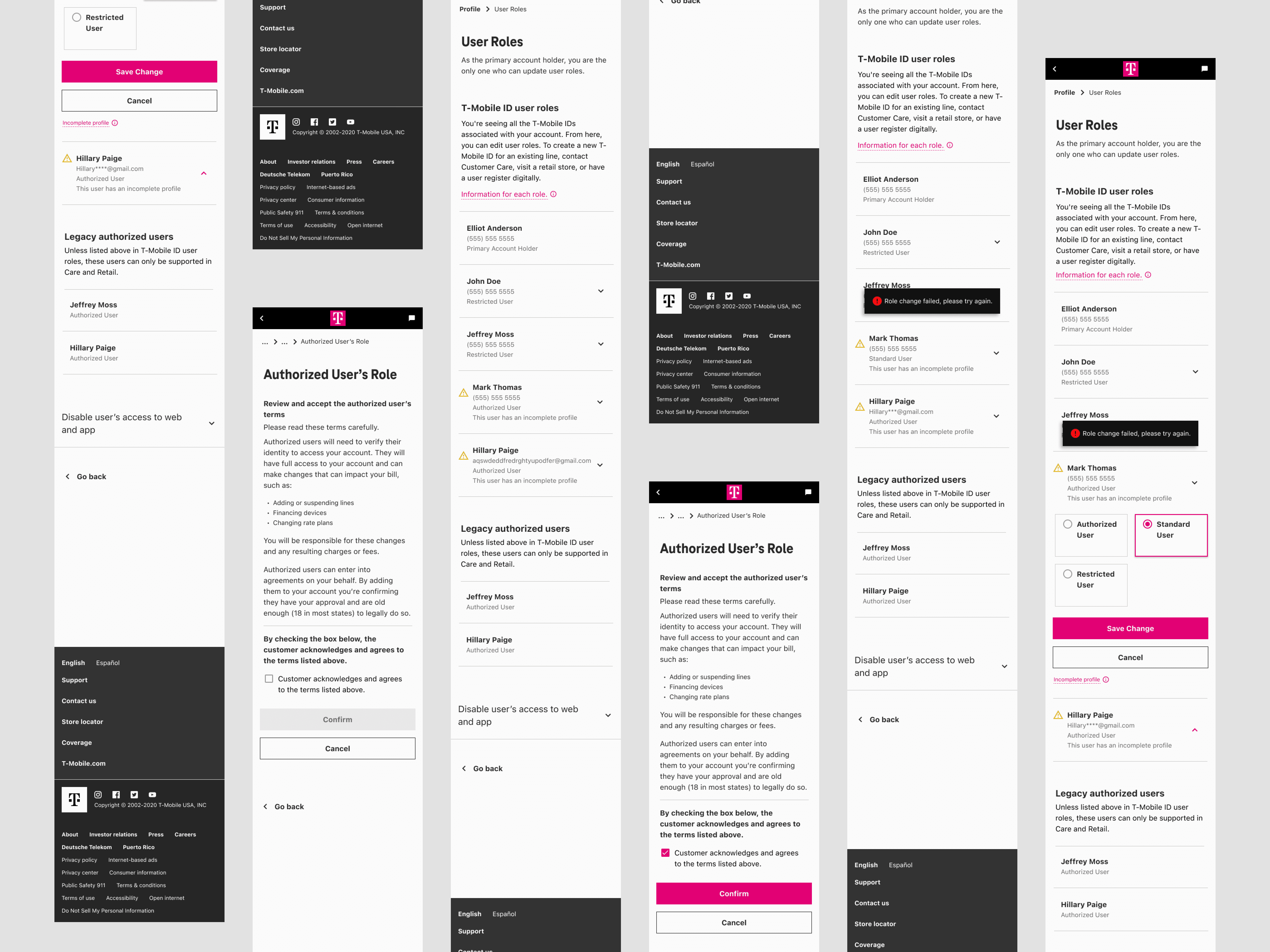
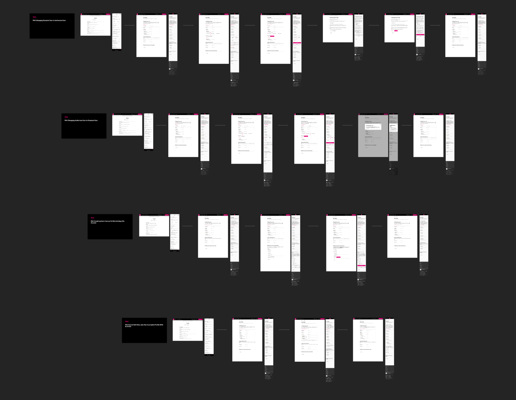
The four user roles existed before this project. My job was to design a distinct experience for each, plus the permission-change flows (which only the Primary Account Holder can perform) across web, mobile, and app.
Primary Account Holder
Full account ownership; the only role that can change other users’ roles digitally. I designed the complete role management flow: selecting a user, choosing a new role, confirming the change, handling failed states, and recovering from errors.
Authorized User
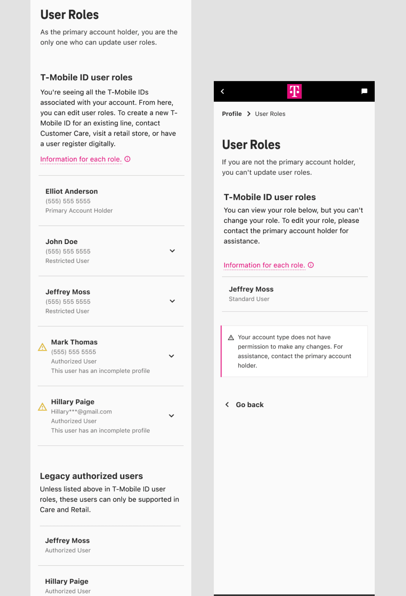
Can view all user roles on the account but can’t make changes. A read-only experience that gave full visibility without surfacing controls they couldn’t use.
Standard User
Sees only their own role. A focused, simplified view that surfaced their information clearly without exposing the broader account structure.
Restricted User
Can’t view their role at all. Designed for that access level while handling the edge states gracefully, never letting the limitation read as a system error.
The choices that defined the experience.
Resolving multiple roles under one ID
The backend assigned roles per phone number, so one person with three lines could hold three different roles. The experience had to present a single, coherent role at the T-Mobile ID level, without making users manage each number, and without any backend change.
Highest-role was the only option that stayed honest to how permissions actually work while hiding complexity the user never needed to see, and it shipped without touching the backend.
Full management for Primary Account Holders
Selection, change, confirmation, and failure handling, designed as one connected flow rather than discrete screens.
Handling legacy in-store accounts
Accounts created on a not-yet-retired in-store system can’t change roles digitally. I designed a clear, non-alarming experience that pointed users to support without reading as a system failure.
Disabling account access
A feature for Primary Account Holders to disable a user’s web and app access entirely, built for situations where a device is lost, stolen, or compromised.
Language and labeling
Prior research showed “line permissions” tested poorly. I replaced that language across the experience and rewrote role names to be understandable without prior knowledge of how T-Mobile’s permissions work.
Three things I’ll carry into every project after this.
Knowing when to push back. Reframing the scope before any design started was the most valuable thing I did.
Designing in partnership with engineering, not around them. The backend constraints weren’t obstacles to work around; they were the design problem itself.
Leading with clarity in ambiguity. No fully defined brief, tight timeline, hard technical limits, scope that had to be renegotiated before work could start. Keeping a team aligned in that environment was as much the job as the design itself.
If I continued this work
- Full backend alignment with the T-Mobile ID model as that infrastructure matures.
- Further simplification of role-change flows.
- Extending the identity experience to additional T-Mobile touchpoints.
My contract ended after this project; post-launch metrics weren’t available to me. What I know is that this redesign directly enabled T-Mobile’s push to adopt T-Mobile IDs across the company.